The CSS3 border-radius property allows web developers to easily utilise rounder corners in their design elements, without the need for corner images or the use of multiple div tags, and is perhaps one of the most talked about aspects of CSS3.
Since first being announced in 2005 the boder-radius property has come to enjoy widespread browser support (although with some discrepancies) and, with relative ease of use, web developers have been quick to make the most of this emerging technology.
Basic example:
#divID { border-radius: 15px; }
However, for the moment, you’ll also need to use the -moz- prefix to support Firefox (see the browser support section of this article for further details):
#divID { -moz-border-radius: 15px; border-radius: 15px; }
How it Works
Rounder corners can be created independently using the four individual border-*-radius properties (border-bottom-left-radius, border-top-left-radius, etc.) or for all four corners simultaneously using the border-radius shorthand property.
We will firstly deal with the syntax for the individual border-*-radius properties before looking at how the border-radius shorthand property works.
border-bottom-left-radius, border-bottom-right-radius, border-top-left-radius, border-top-right-radius
The border-*-radius properties can each accept either one or two values, expressed as a length or a percentage (percentages refer to the corresponding dimensions of the border box).
The Syntax:
Examples:
border-bottom-right-radius: 10% 5%;
border-top-right-radius: 10px;
Where two values are supplied these are used to define, in order, the horizontal and vertical radii of a quarter ellipse, which in turn determines the curvature of the corner of the outer border edge.
Where only one value is supplied, this is used to define both the horizontal and vertical radii equally.
The following diagram gives a few examples of how corners might appear given differing radii:
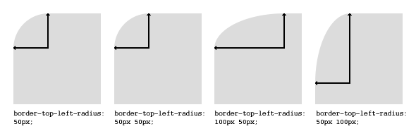
If either value is zero, the corner will be square, not round.
border-radius
The border-radius shorthand property can be used to define all four corners simultaneously. The property accepts either one or two sets of values, each consisting of one to four lengths or percentages.
The Syntax:
Examples:
 border-radius: 5px 10px 5px 10px / 10px 5px 10px 5px;
border-radius: 5px;
border-radius: 5px 10px / 10px;
The first set of (1-4) values define the horizontal radii for all four corners. An optional second set of values, preceded by a ‘/’, define the vertical radii for all four corners. If only one set of values are supplied, these are used to determine both the vertical and horizontal equally.
For each set of values the following applies:
If all four values are supplied, these represent the top-left, top-right, bottom-right and bottom-left radii respectively. If bottom-left is omitted it is the same as top-right, if bottom-right is omitted it is the same as top-left, and if only one value is supplied it is used to set all four radii equally.
Browser Support
At present Opera (version 10.5 onward), Safari (version 5 onward) and Chrome (version 5 onward) all support the individual border-*-radius properties and the border-radius shorthand property as natively defined in the current W3C Specification (although there are still outstanding bugs on issues such as border style transitions, using percentages for lengths, etc.).
Mozilla Firefox (version 1.0 onward) supports border-radius with the -moz- prefix, although there are some discrepancies between the Mozilla implementation and the current W3C specification (see below).
Update:Recent Firefox nightly versions support border-radius without the -moz- prefix.
Safari and Chrome (and other webkit based browsers) have supported border-radius with the -webkit- prefix since version 3 (no longer needed from version 5 onward), although again with some discrepancies from the current specification (see this article for further details of how older versions of Webkit handle border-radius).
Even Microsoft have promised, and demonstrated in their recent preview release, support for border-radius from Internet Explorer 9 onward (without prefix).
Workaround for Opera 10.10 and below
The Opera method is a little more robust than the IE hack, in that it supports rounding only certain corners of an element, and can also be easily used dynamically with CSS and Javascript effects.
The downsides are that it can only be used with block colors for whatever has the rounded corners, and whatever it is sitting on. This means that you can’t use it over anything textured or semi-transparent. Additionally, this method causes a brief flicker while it loads up, which is mostly noticeable when using it dynamically.
Finally, the Opera method is a little annoying to use, since you have to generate new CSS output for every color combination.
In Summary
These methods allow developers to support CSS rounded corners in all major browsers. As of IE9, IE will support border-radius, but until then this hack allows us to support it with only a few conditions (and for all the losers still on IE6). Opera has already implemented border-radius support since this article was written, but for versions prior to 10.5, the Opera SVG hack works well enough. (You may consider ignoring legacy support for Opera, due to its low market share.)