We see triangles everywhere: on tooltips, dropdowns and even on loading animations. Like it or not, these small elements are quite important when trying to build some relationships between various UI elements.
There are some different ways to build a triangle for your web designs and in this article you’ll see how you can actually do that.

Encoded image

Assuming you already created your custom triangle image and you want to save a valuable HTTP request, then converting it into a base64 string is the best solution.
Useful tools:
Pros
- You can design it as you wish using shadows, gradients and strokes and then just encode it.
Cons
- You’ll need a tool like Photoshop/Gimp to edit it.
- For larger images, the resulting string can be quite huge.
- Older browsers like IE6/IE7 do not support this type of encoding.
CSS borders
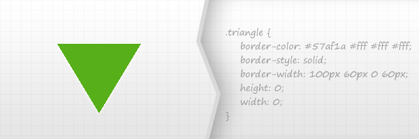
This is also a pretty common technique used on stuff like tooltips and dropdowns. Together with the above, this is one of my favorite methods for creating small and useful triangles.
Pros
- Easy to update color and size by adjusting some CSS values.
- This is a cross browser solution.
Cons
- This technique consist of using borders, so you can’t add shadows, gradients and other CSS3 awesomeness.
- Keep in mind that IE6 doesn’t support transparent borders – in case you care about this matter anymore.
- If you’re using Firefox, be aware that CSS’s “transparent” may not be transparent, especially on diagonal borders.
HTML entity
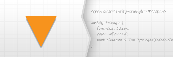
Pros
- It’s a cross browser technique.
- You can add a shadow using CSS3′s
text-shadow
property.
Cons
- Again, you can’t play too much with CSS3 here, excepting the use of
text-shadow
.
- It’s quite impossible to achieve pixel perfection across all browsers.
Don’t forget to check this wonderful resource: http://copypastecharacter.com/.
Besides using an entity, if you’re already using an iconic font in your project, then you can simply use an arrow symbol from the available ones (in case there is one).
CSS rotated square
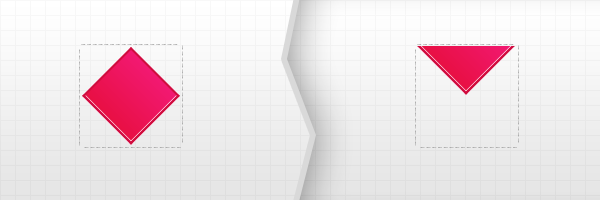
Basically, for this technique to work, you’ll need two blocks. But, it’s not mandatory to use two elements, so you can use an element with a pseudo-element for example.
- Create a box. e.g. 100×100 px – this one will contain the rotated block.
- Rotate the contained block by 45deg to obtain the diamond shape.
- Shift the diamond shape to the top then set
overflow: hidden
to the wrapping block to show just the part we’re interested in.
- There you go!
Pros
- The possibility of playing with CSS3 box shadow, gradients etc.
Cons
- This solution is not cross browser, first of all because of the CSS3 transform, unless perhaps you’re a bit crazy and use something like cssSandpaper.
HTML5 Canvas
Having the following
canvas
element in your HTML file:
… here’s how to draw a triangle using JavaScript:
SVG (Scalable Vector Graphics)
This is how you can define an inline SVG triangle in your markup:
Then, just add some styles:
.svg-triangle{
	margin: 0 auto;
	width: 100px;
	height: 100px;
}

.svg-triangle polygon {
	fill:#98d02e;
	stroke:#65b81d;
	stroke-width:2;
}
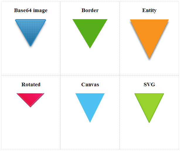
Here how does it look:
Let me know your thoughts about these ways to build triangles, what is the method you use more often?